相關係數與其視覺化工具的R實作
2021/11/16
這篇建議搭配網誌內的相關係數文章一起看。用R算相關係數相當容易,這篇文章也會包含資料視覺化 (data visualization) 的工具,可以參考R官方的readme,相當的有幫助。
If you really believe in what you’re doing, work hard, take nothing personally and if something blocks one route, find another. Never give up.
—Laurie Notaro
相關係數以及其顯著性
最基本要做的事情就是計算相關係數以及其顯著性,這裡我先使用一個示範資料
# 讀取資料
data(mtcars)  # 讀取一個R裡面內建的資料
head(mtcars)  # 看一下這個資料的開頭六筆資料
你應該會得到下面這樣的結果
                   mpg cyl disp  hp drat    wt  qsec vs am gear carb
Mazda RX4         21.0   6  160 110 3.90 2.620 16.46  0  1    4    4
Mazda RX4 Wag     21.0   6  160 110 3.90 2.875 17.02  0  1    4    4
Datsun 710        22.8   4  108  93 3.85 2.320 18.61  1  1    4    1
Hornet 4 Drive    21.4   6  258 110 3.08 3.215 19.44  1  0    3    1
Hornet Sportabout 18.7   8  360 175 3.15 3.440 17.02  0  0    3    2
Valiant           18.1   6  225 105 2.76 3.460 20.22  1  0    3    1
這個資料是R裡面內建的,大致上就是有32台車子的11個變數資料,我們會拿這筆資料來當作示範。
第一步是讀取下面這個函數,只要複製貼上然後讀取即可,這是由網路上別人寫好的函數再修改而成,參考資料包含:
- Elegant correlation table using xtable R package
- Beautiful Correlation Tables in R
- Correlation matrix one side with significance
- Create a publication-ready correlation matrix, with significance levels, in R
These codes do not originate from me. You can freely use these codes but please pay tribute to the websites above.
# 建立函數
corstars <- function(x, method=c("pearson", "spearman"), removeTriangle=c("upper", "lower"), result=c("none", "html", "latex")){
  #Compute correlation matrix
  require(Hmisc)
  x <- as.matrix(x)
  correlation_matrix<-rcorr(x, type=method[1])
  R <- correlation_matrix$r # Matrix of correlation coeficients
  p <- correlation_matrix$P # Matrix of p-value

  ## Define notions for significance levels; spacing is important.
  mystars <- ifelse(p < .001, "*** ", ifelse(p < .01, "**  ", ifelse(p < .05, "*   ", "    ")))

  ## trunctuate the correlation matrix to two decimal
  R <- format(round(cbind(rep(-1.11, ncol(x)), R), 2))[,-1]

  ## build a new matrix that includes the correlations with their apropriate stars
  Rnew <- matrix(paste(R, mystars, sep=""), ncol=ncol(x))
  diag(Rnew) <- paste(diag(R), " ", sep="")
  rownames(Rnew) <- colnames(x)
  colnames(Rnew) <- paste(colnames(x), "", sep="")

  ## remove upper triangle of correlation matrix
  if(removeTriangle[1]=="upper"){
    Rnew <- as.matrix(Rnew)
    Rnew[upper.tri(Rnew, diag = TRUE)] <- ""
    Rnew <- as.data.frame(Rnew)
  }

  ## remove lower triangle of correlation matrix
  else if(removeTriangle[1]=="lower"){
    Rnew <- as.matrix(Rnew)
    Rnew[lower.tri(Rnew, diag = TRUE)] <- ""
    Rnew <- as.data.frame(Rnew)
  }

  ## remove last column and return the correlation matrix
  Rnew <- cbind(Rnew[1:length(Rnew)-1])
  if (result[1]=="none") return(Rnew)
  else{
    if(result[1]=="html") print(xtable(Rnew), type="html")
    else print(xtable(Rnew), type="latex")
  }
}
這個函數讀取完之後,你的R裡面會增加一個function稱作corstars,只要對資料使用corstars就可以得到結果。
corstars(mtcars)                      # 直接顯示結果
result1 <- corstars(mtcars)           # 將結果存到result1這個變數
write.csv(result1, "corrtable.csv")   # 將結果輸出成csv檔 (檔案會在你指定的working directory)
這樣會得到相關係數的結果
           mpg       cyl      disp        hp      drat        wt      qsec        vs        am      gear
mpg
cyl     -0.85***
disp    -0.85***   0.90***
hp      -0.78***   0.83***   0.79***
drat     0.68***  -0.70***  -0.71***  -0.45**
wt      -0.87***   0.78***   0.89***   0.66***  -0.71***
qsec     0.42*    -0.59***  -0.43*    -0.71***   0.09     -0.17
vs       0.66***  -0.81***  -0.71***  -0.72***   0.44*    -0.55***   0.74***
am       0.60***  -0.52**   -0.59***  -0.24      0.71***  -0.69***  -0.23      0.17
gear     0.48**   -0.49**   -0.56***  -0.13      0.70***  -0.58***  -0.21      0.21      0.79***
carb    -0.55**    0.53**    0.39*     0.75***  -0.09      0.43*    -0.66***  -0.57***   0.06      0.27
如何,是不是相當簡單呢?
資料視覺化的熱圖 (heatmap)
相關係數表可以很簡單的表現呈熱圖的形式,顏色可以一目瞭然,可以使用套件ggcorrplot來達成
# 讀取套件與建立相關係數表
library(ggcorrplot)
corr <- round(cor(mtcars), 2)   # 由兩個函數組成,cor(mtcars)建立相關係數表,round則是用於四捨五入到小數點下2位數
corr
你應該可以得到下面這樣的結果
       mpg   cyl  disp    hp  drat    wt  qsec    vs    am  gear  carb
mpg   1.00 -0.85 -0.85 -0.78  0.68 -0.87  0.42  0.66  0.60  0.48 -0.55
cyl  -0.85  1.00  0.90  0.83 -0.70  0.78 -0.59 -0.81 -0.52 -0.49  0.53
disp -0.85  0.90  1.00  0.79 -0.71  0.89 -0.43 -0.71 -0.59 -0.56  0.39
hp   -0.78  0.83  0.79  1.00 -0.45  0.66 -0.71 -0.72 -0.24 -0.13  0.75
drat  0.68 -0.70 -0.71 -0.45  1.00 -0.71  0.09  0.44  0.71  0.70 -0.09
wt   -0.87  0.78  0.89  0.66 -0.71  1.00 -0.17 -0.55 -0.69 -0.58  0.43
qsec  0.42 -0.59 -0.43 -0.71  0.09 -0.17  1.00  0.74 -0.23 -0.21 -0.66
vs    0.66 -0.81 -0.71 -0.72  0.44 -0.55  0.74  1.00  0.17  0.21 -0.57
am    0.60 -0.52 -0.59 -0.24  0.71 -0.69 -0.23  0.17  1.00  0.79  0.06
gear  0.48 -0.49 -0.56 -0.13  0.70 -0.58 -0.21  0.21  0.79  1.00  0.27
carb -0.55  0.53  0.39  0.75 -0.09  0.43 -0.66 -0.57  0.06  0.27  1.00
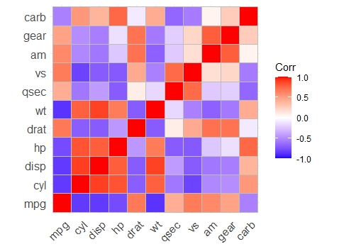
只要讓套件ggcorrplot讀取這個表格,就可以繪製熱圖
ggcorrplot(corr)
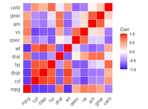
# 改變外框間距顏色
ggcorrplot(corr,
           outline.color = "white")
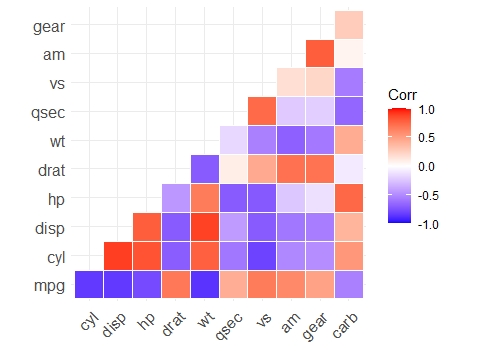
# 只顯示下半部的圖
ggcorrplot(corr,
           type = "lower",
           outline.color = "white")
其他當然還有許多的變化,這就要看這個函數提供了哪些功能,可以達到完全的客製化。
如果只是想使用的話底下可以不用繼續看,有想研究的人再看就好,底下是我複製過來的函數變數,把太過瑣碎不會用到的拿掉了,基本上全部都有預設所以不改也沒差。
ggcorrplot(corr,
           method = c("square", "circle"),       # 選擇輸出的圖是正方形還是圓形,預設是正方形
           type = c("full", "lower", "upper"),   # 選擇要整張圖、上半還是下半,預設是整張圖
           title = "",                           # 圖的標題,不解釋
           show.legend = TRUE,                   # 是否顯示各變數名稱,通常都要啦
           legend.title = "Corr",                # 那條熱圖顏色的標示名稱,可以改成"相關係數"之類的
           colors = c("blue", "white", "red"),   # 可以自己調成喜歡的顏色
           outline.color = "gray",               # 外框顏色
           hc.order = FALSE,                     # 這個函數可以幫你用階層式分群 (hierarchical clustering) 排列變數
           hc.method = "complete",               # 續階層式分群
           lab = FALSE,                          # 是否在各個色塊顯示相關係數的數值,改成T的話就會顯示
           digits = 2,                           # 續顯示數值,顯示幾個位數
           lab_col = "black",                    # 續顯示數值,改顏色
           lab_size = 4,                         # 續顯示數值,改大小
           p.mat = NULL,                         # 可以選擇新增一個p-value矩陣,要另外算一個
           sig.level = 0.05,                     # 續p-value,提供p-value就可以把不顯著的刪除掉
           insig = c("pch", "blank"),            # 不顯著的要怎麼辦,選"pch"的話會打叉,選"blank"就可以空白

           # 接下來是常見的美工項目,pch是不顯著打叉的圖案,tl是變數的標題
           pch = 4, pch.col = "black", pch.cex = 5,
           tl.cex = 12, tl.col = "black", tl.srt = 45)
額外補充,要製作p-value矩陣其實也只是一行code的事情,把輸出的p-value矩陣輸入p.mat (p matrix的意思) 就可以得到區隔不顯著的圖。
p.mat <- cor_pmat(mtcars)
head(p.mat[, 1:4])
ggcorrplot(corr,
           hc.order = TRUE,
           type = "lower",
           p.mat = p.mat)
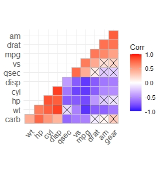
可以發現用了階層式分群的話顏色就會比較整齊,如果insig="blank"的話打叉的地方就會變空白。